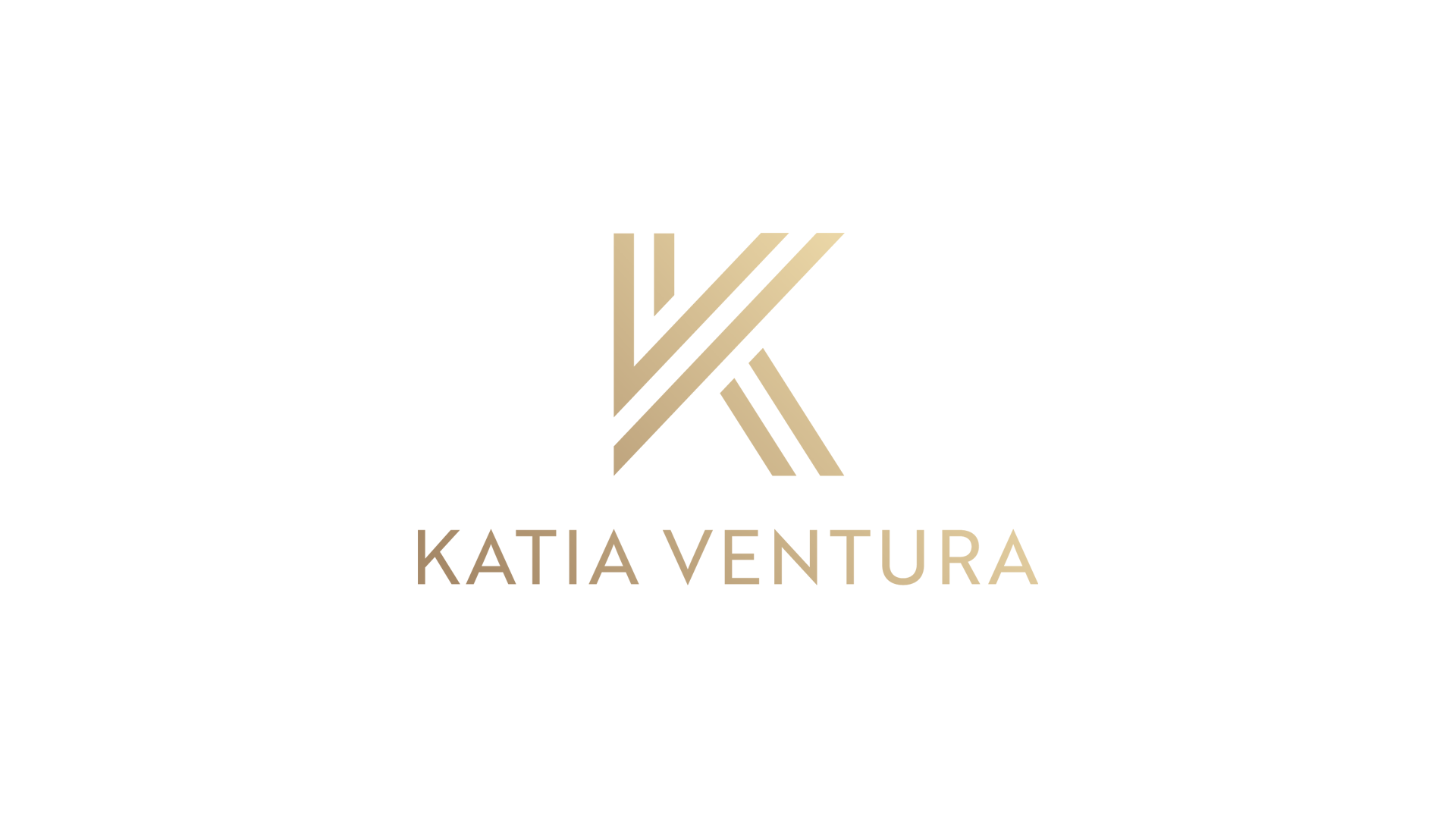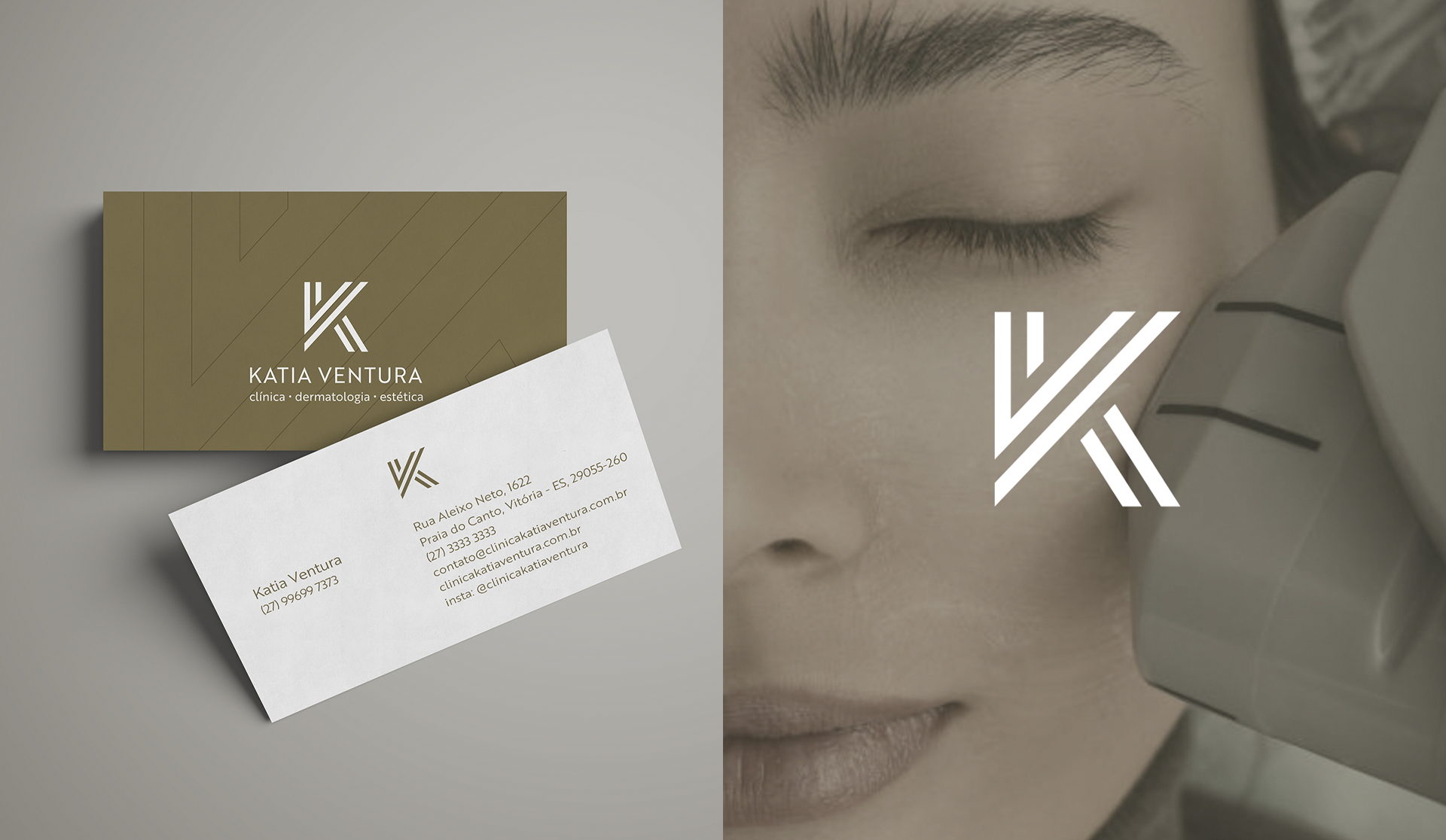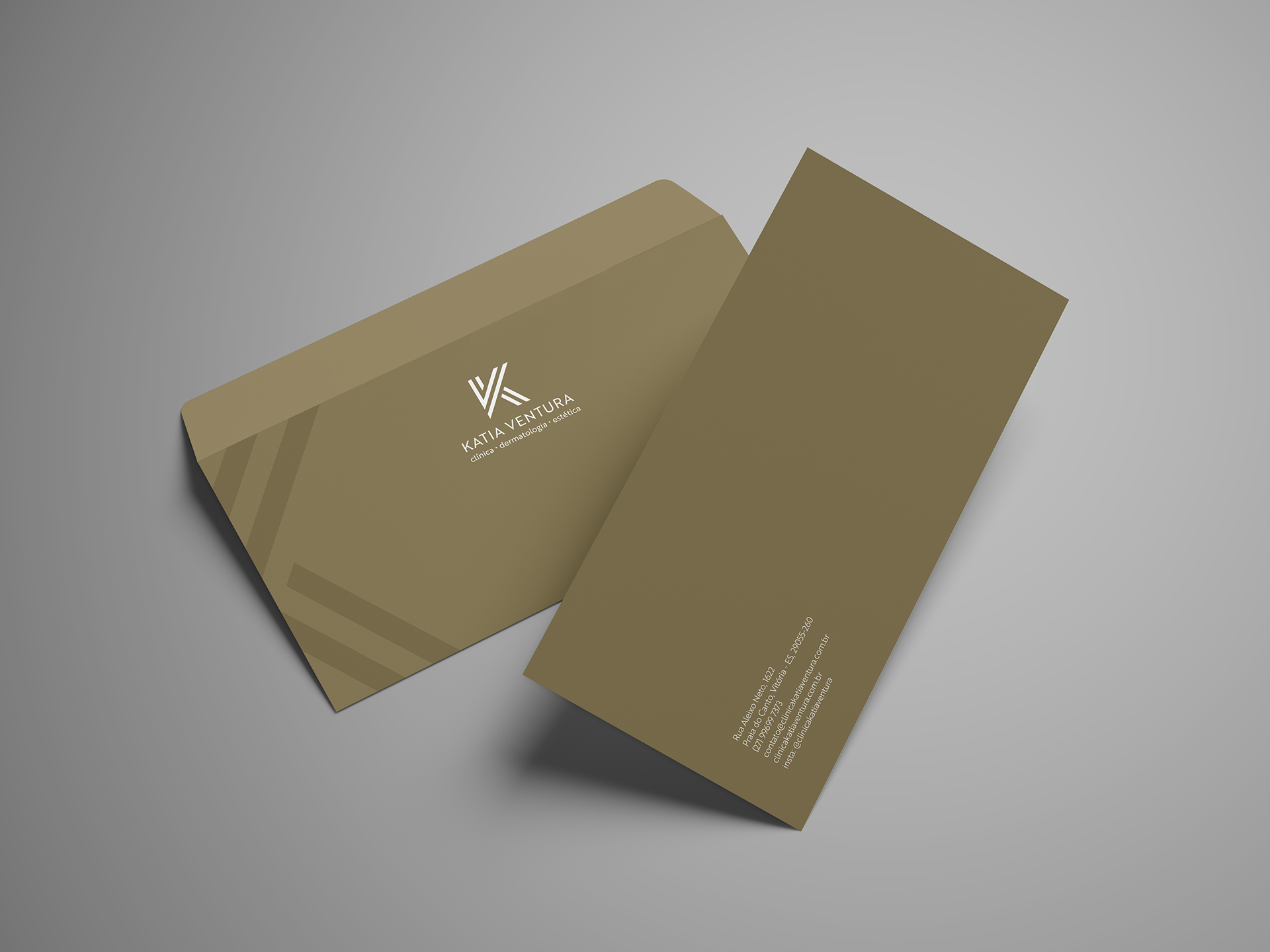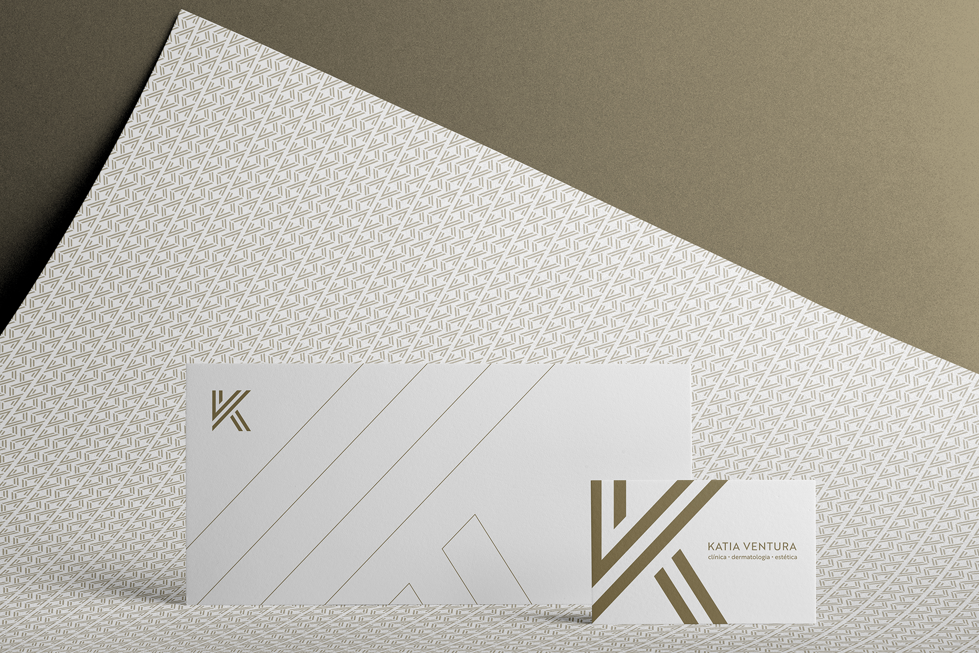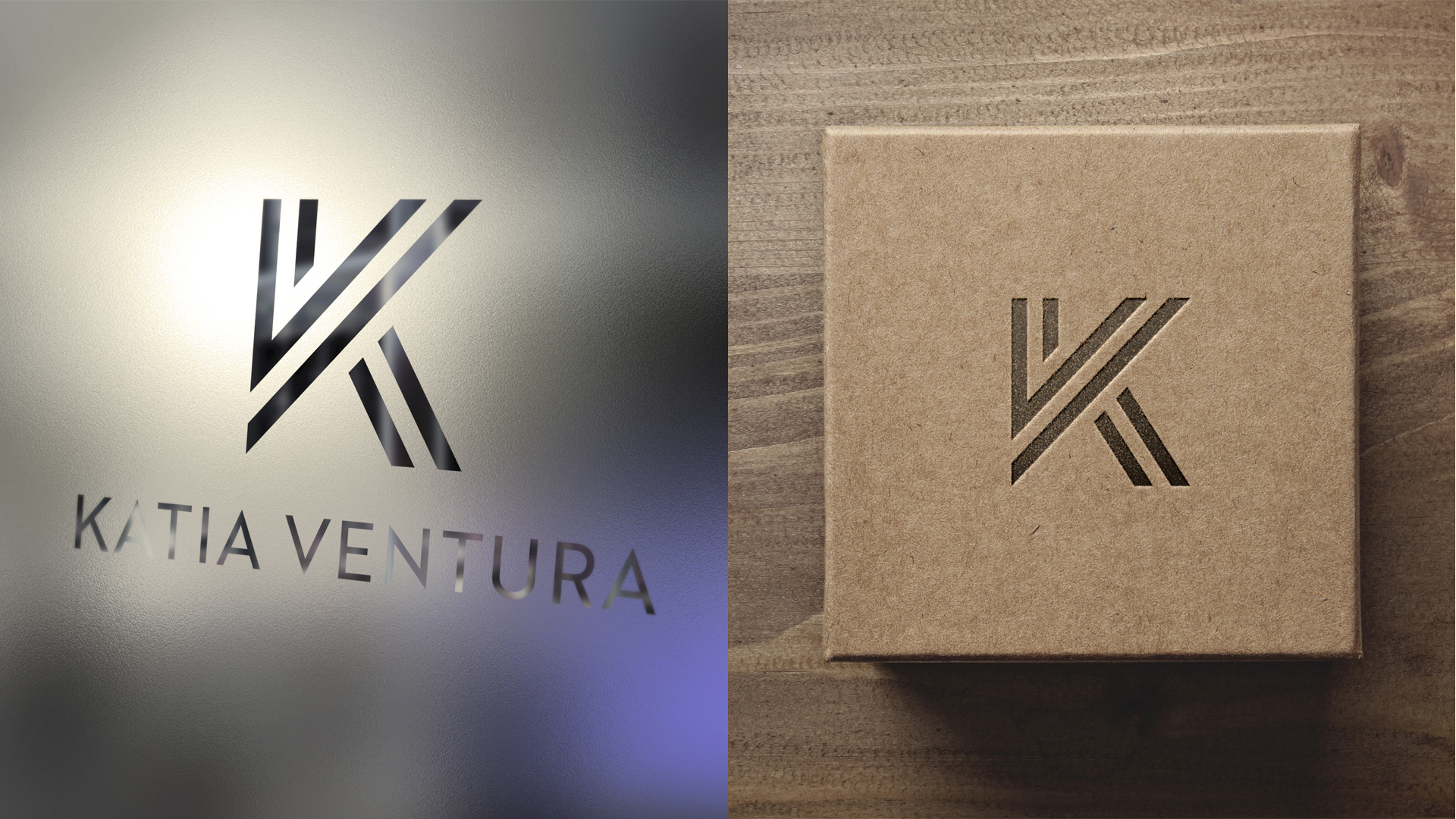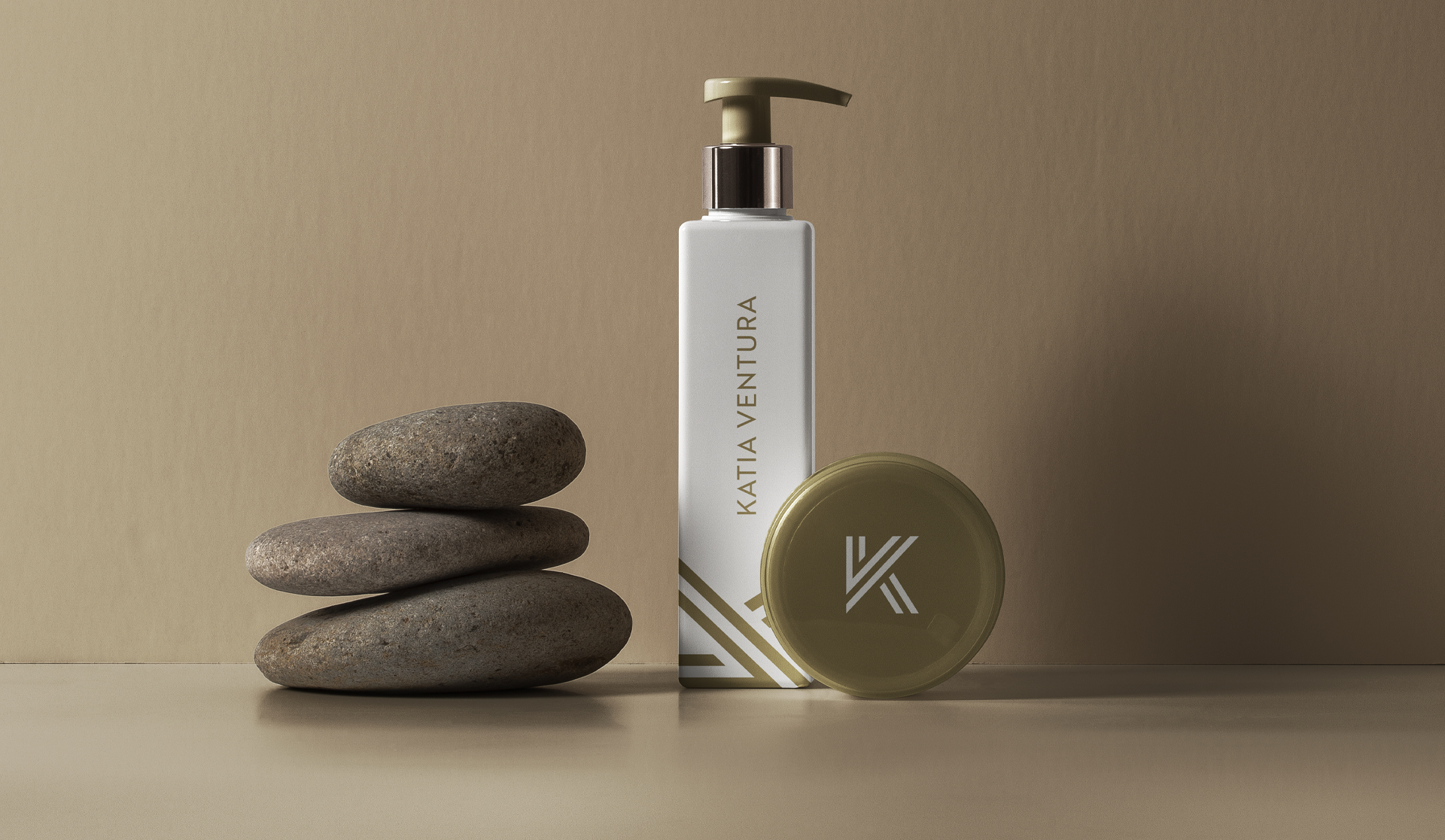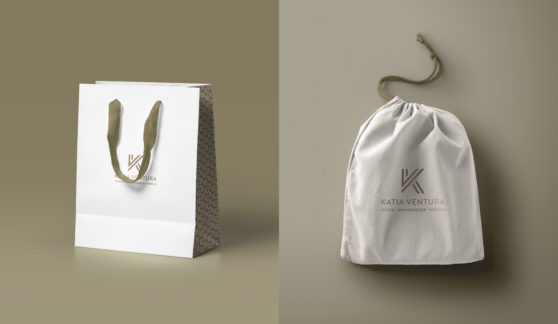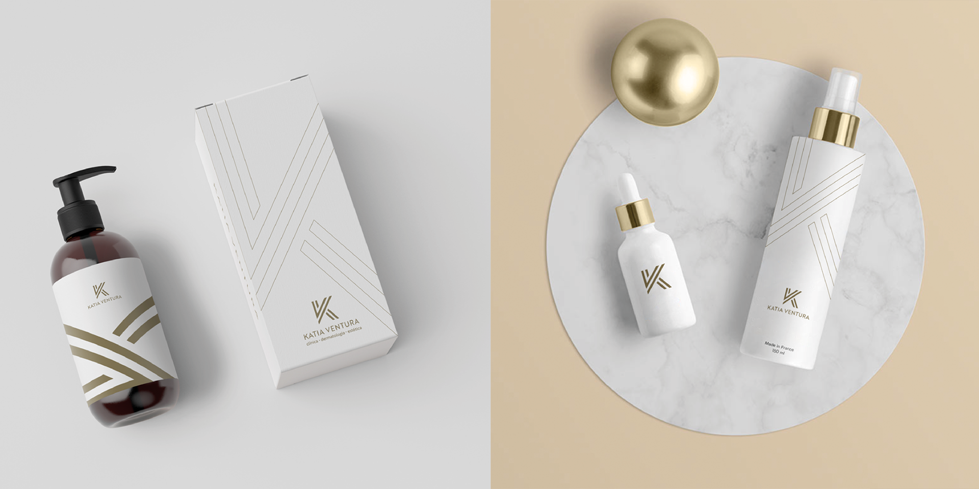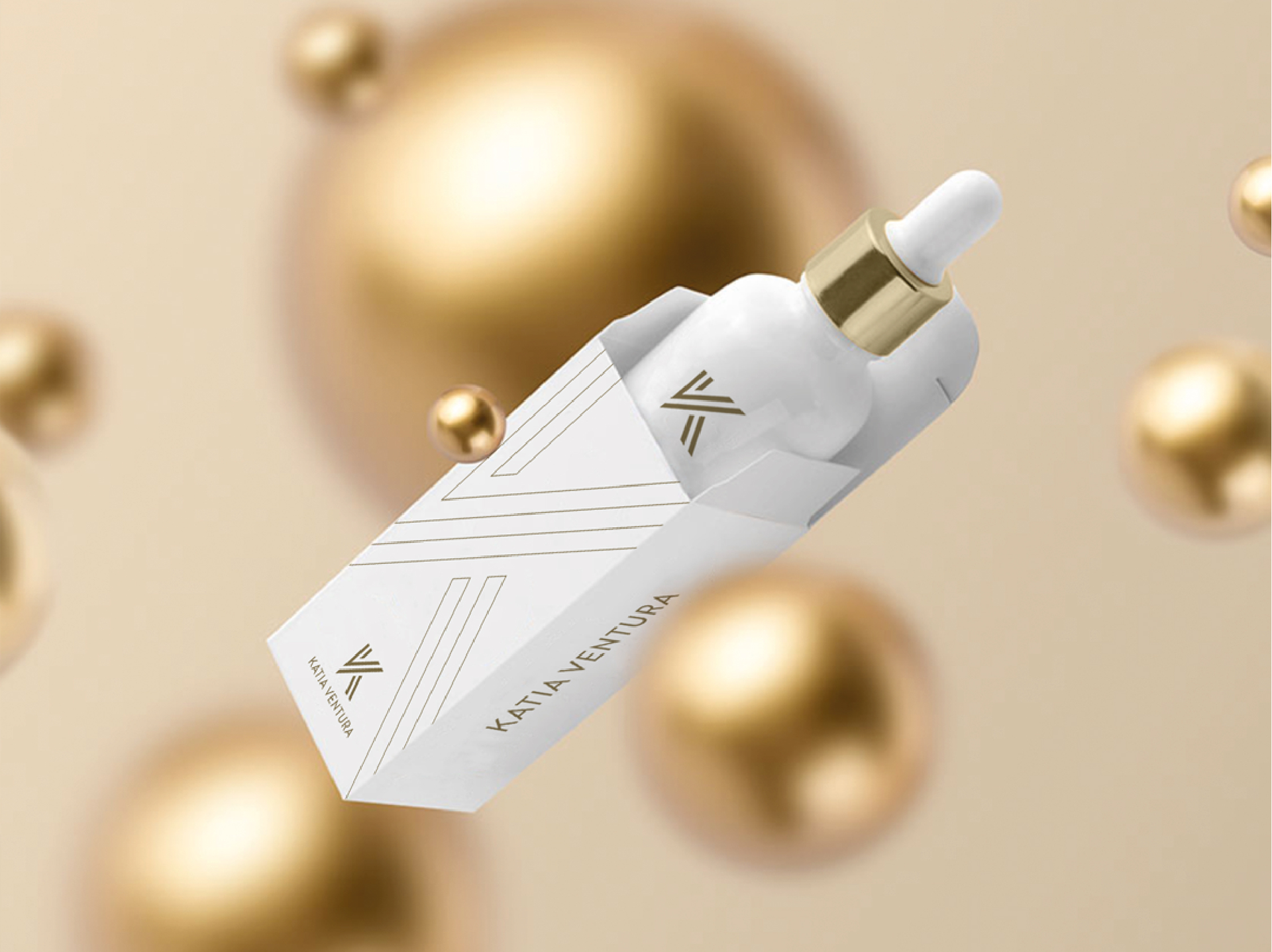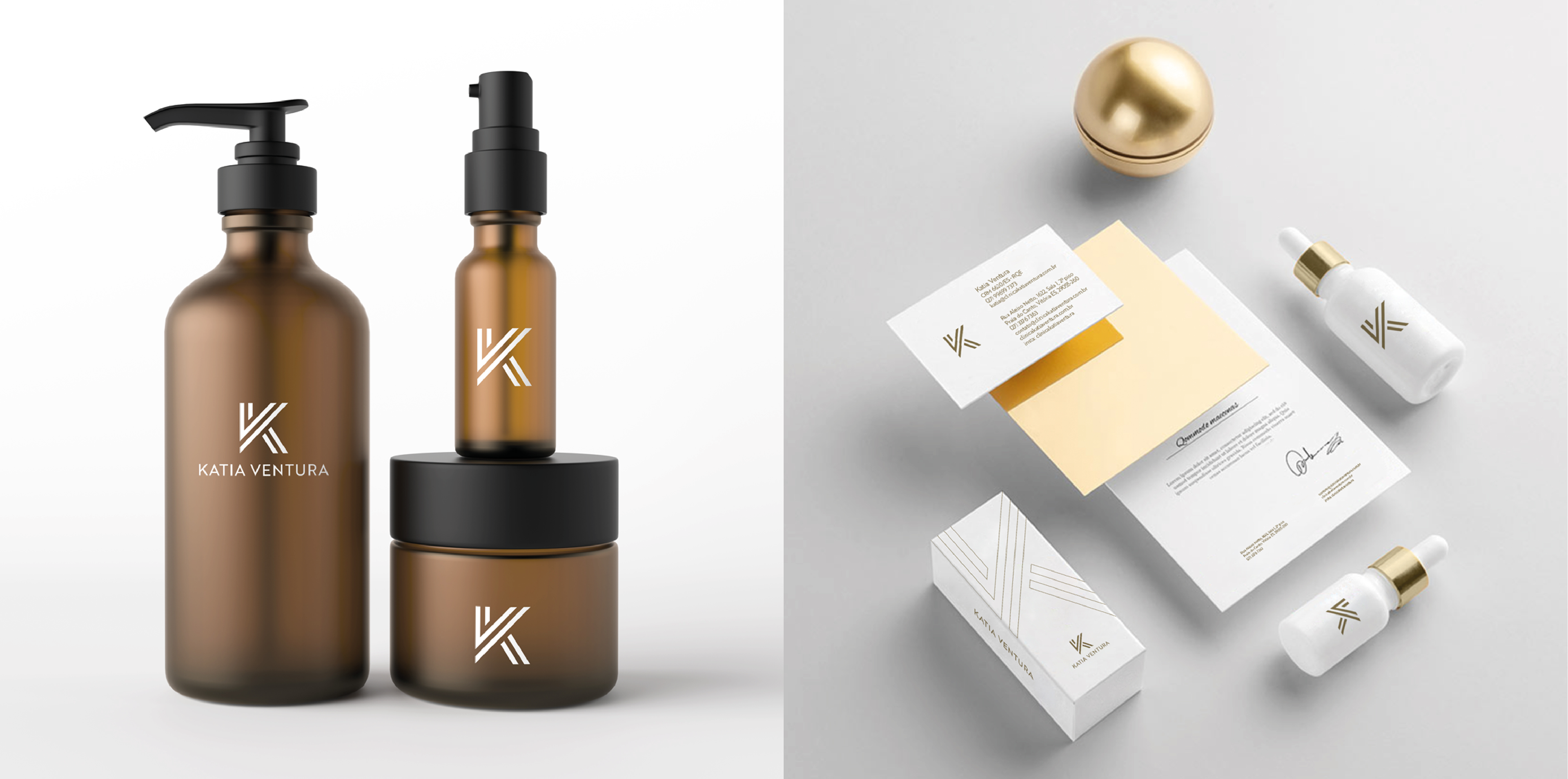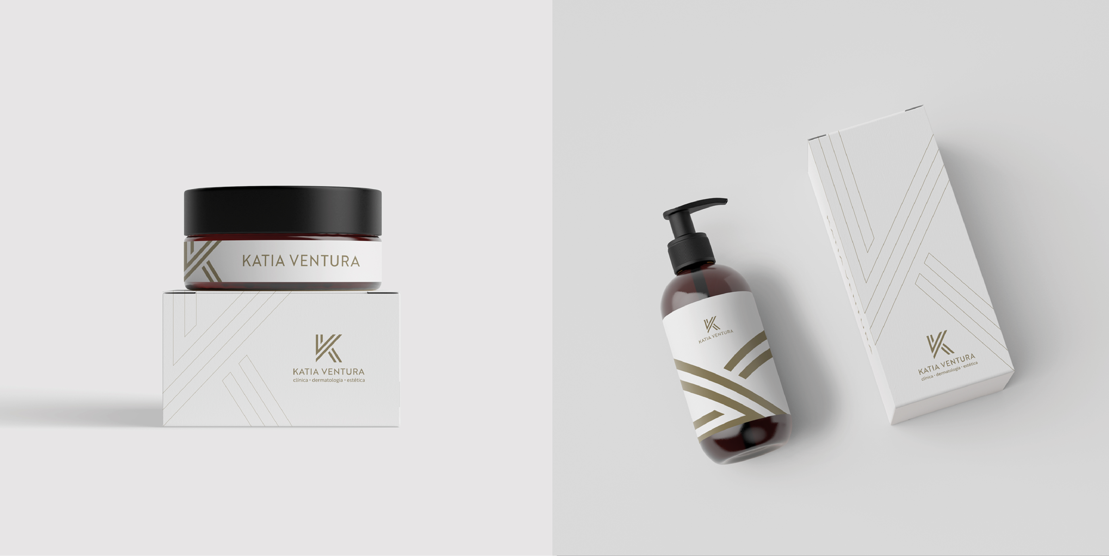
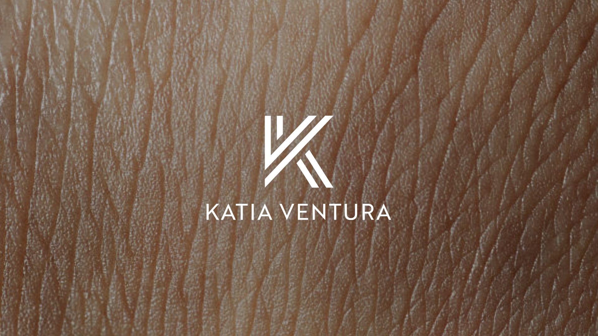
O ponto de partida para a criação da marca foram as iniciais do nome "k" e "v".
A proposta, além de ter sido um pedido, também reforça a identidade e a personaliza
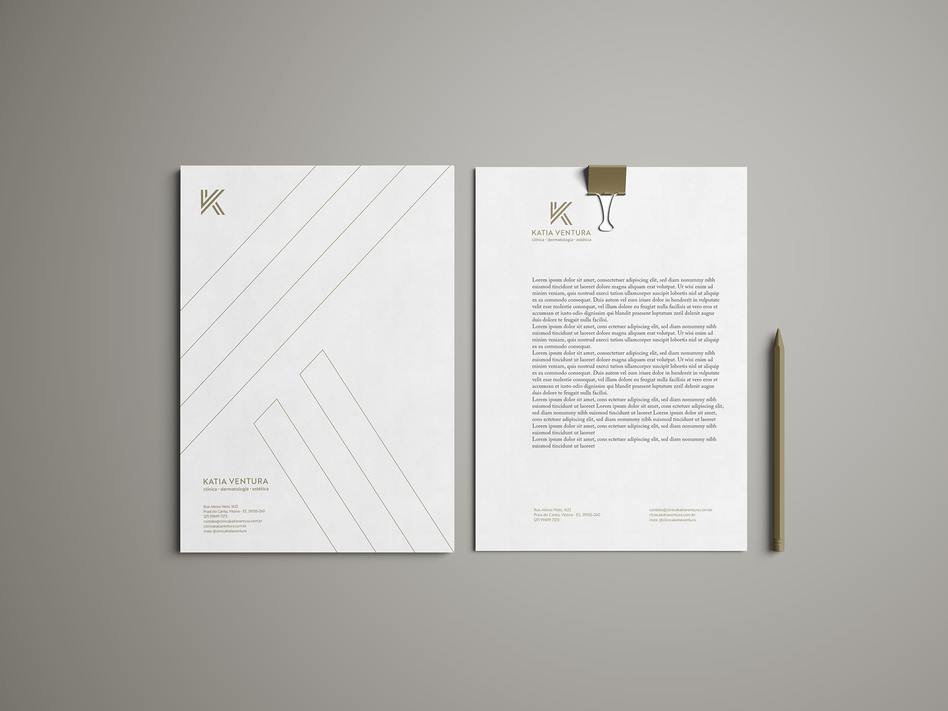
de maneira profissional. Outro ponto trabalhado no logo foram as linhas, representando as camadas da epiderme, mas tratando isso de uma forma subjetiva.
de maneira profissional. Outro ponto trabalhado no logo foram as linhas, representando as camadas da epiderme, mas tratando isso de uma forma subjetiva.
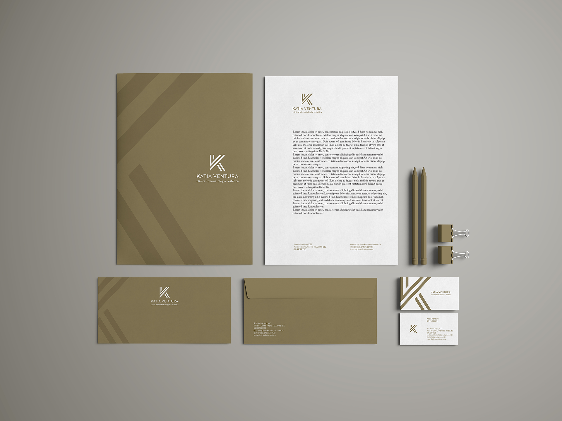
As linhas também sugerem um trabalho contínuo, que também deve ser o tratamento da pele. As cores escolhidas são elegantes e sóbrias, trazendo uma paleta mais natural para a composição.
The starting point for the brand creation was the initials of the name "k" and "v".
The proposal, besides being a request, also reinforces the identity and personalizes it in a professional manner. Another aspect worked on in the logo were the lines, representing the layers of the epidermis, but treating it in a subjective way.
The lines also suggest a continuous work, which should also be the treatment of the skin. The chosen colors are elegant and sober, bringing a more natural palette to the composition.